16 June 2023
Reading time: 5 minutes
When it comes to choosing a compliant and suitable LRV colour scheme for an ambulant or accessible washroom, designers often face challenges in finding the perfect balance between aesthetics, accessibility, and functionality.
With extensive experience in the commercial washroom design industry, especially in supplying Doc M packs and sets, Dolphin Solutions has observed various trends and considerations, allowing us to guide designers in making informed choices regarding their LRV colour chart selection.
Because we understand the importance of LRV colour palettes in creating inclusive and visually appealing washrooms, we have written this article that focuses on the significance of colour contrast, following accessibility guidelines, balance, lighting conditions, user preferences, and the impact some colours may have on users with colour vision deficiencies.
By the end of this article, you will have a comprehensive understanding of the LRV colour chart and balancing colour contrasts, enabling you to choose the best shades and hues to design the most sophisticated and accessible Doc M washroom.

Considerations for choosing the best LRV colour palette
Selecting the best colours for your washroom from the LRV colour chart depends on various factors such as the specific space, intended ambience, design goals, and user needs.
However, there are some general considerations to keep in mind when creating colour palettes:
Contrast
Opt for colours with significant LRV differences to create visual contrast and enhance visibility between flat surfaces (wall and floor) and washroom products, and for a combination of washroom products grouped together, for example, the tap and wash basin.
You can find the Light Reflectance Values in BS 4800 range of colours comprising 100 paint colours and their available finishes. It includes an explanatory text and a mask that works together with BS 5252 to show the specified colours.
Reading BS 4800 alongside BS 5252 is important for a complete understanding of contrasting colours from the LRV colour chart.
Accessibility
Consider LRV guidelines and regulations to ensure the colours chosen from the LRV colour chart meets the contrast requirements for specific washroom products, such as signage, grab rails, and other important features in accessible and ambulant washrooms.
For more details about colour and contrast, you can also refer to “The Colour, Light, and Contrast Manual – Designing and Managing Inclusive Built Environments.”
Balance
Aim for a balanced colour scheme that harmonises with the overall washroom design and achieves the desired aesthetic. This may involve combining light and dark shades from the LRV colour chart to create visual interest and depth.
For example, black grab rails, taps, hand dryers etc. against pale or neutral colour walls, or a grey toilet seat on a white WC pan.
Lighting conditions
Consider the lighting conditions in the space, as they can influence the perception of colour. Test the colours from the LRV colour chart under the actual lighting conditions to ensure they appear as intended.
According to the specifications outlined in Document Part M, surfaces with illuminance greater than 200 lux should have a minimum Light Reflectance Value contrast difference of 20 points. However, the recommended LRV range is 30 points difference or more.

User preferences
Consider the preferences and psychological effects of colours on individuals. Colours can evoke different emotions and moods, so choose shades and hues from the LRV colour chart that align with the desired atmosphere or purpose of the space.
For example, red walls can evoke intense emotions, while an ocean blue colour promotes a feeling of calmness.
Learn more about commercial washroom design for wellbeing and wellness.
Colour vision deficiency
When choosing your colours from the LRV colour chart, it is also important to not only consider those who are partially sighted, but also to consider those who are colour blind. According to Colour Blind Awareness, about 4.5% of the UK population is colour blind.
Colour blindness, or colour vision deficiency, is a condition where individuals struggle to differentiate between certain colours. The most common type is red-green colour blindness. People with this condition may have difficulty distinguishing between shades of red and green, leading to confusion with contrasting colours that rely on these shades.
Another challenge that individuals may face is when the walls of an accessible washroom are red, and the emergency pull cord is also red. This situation can be particularly difficult for individuals with a colour vision deficiency, as they may struggle to locate the alarm pull cord in case of an emergency and would have to rely on their memory and common sense to determine its location.
Colour blindness can vary in severity and type, so experiences may differ among individuals.
What are the most popular LRV colour contrasts?
From our experience working on a multitude of washroom projects, we have observed the following colour contrasts, hues, and shades from the LRV colour chart in ambulant and accessible washrooms:
| Dolphin Case Study | Ambulant and Accessible Washrooms | Washroom Products (grab rails, soap dispenser, tap, etc.) |
|---|---|---|
| Central House | 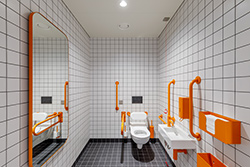 | Burnt orange |
| Central House | 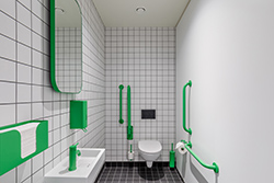 | Bright green |
| Central House | 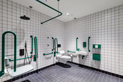 | Dark green |
| Lakeside House | 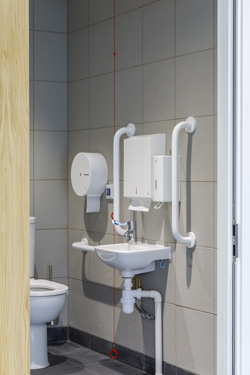 | White |
| 155 Bishopsgate | 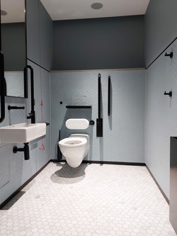 | Matte black |
| One Canada Square | 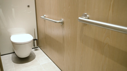 | Brushed satin stainless steel |
| St Botolph Building | 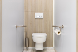 | Brushed satin stainless steel |
| Turnmill, Clerkenwell | 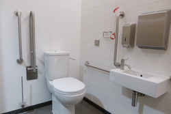 | Brushed satin stainless steel |
| Theatre Royal Hay Market | 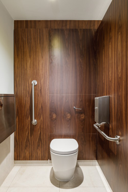 | Brushed satin stainless steel |
| Finsbury Circus | 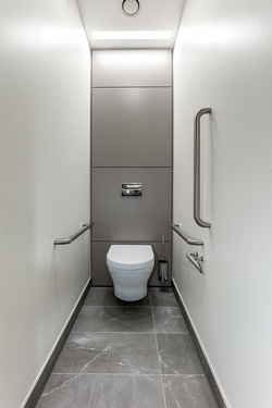 | Brushed satin stainless steel |
| Kensington and Chelsea College | 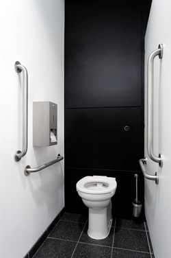 | Brushed satin stainless steel |
| Victoria & Albert Museum | 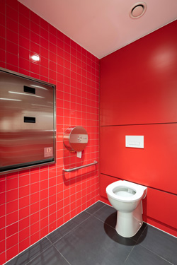 | Brushed satin stainless steel |
As you can see, some designers have opted for adventurous and bold colours from the LRV colour chart. These colours stand out, creating a high contrast that is easily distinguishable for individuals with vison impairments.
However, for the most part, we have observed neutral earthy tones with brushed satin stainless steel, essentially following the commercial washroom design trends for 2023.

Is brushed satin stainless steel a good colour contrast with neutral earth tone surfaces?
Yes, brushed satin stainless steel can be a good colour contrast for a neutral earthy tone walls and tiling because it has a reflective and metallic appearance that can provide a visually appealing contrast.
The brushed finish of satin stainless steel adds texture and depth to the overall aesthetic, further enhancing the contrast. It can also complement the natural elements and textures often found in earthy colour schemes, such as wood or stone.
However, people with visual impairments may have varying degrees of vision and contrast sensitivity, and brushed satin stainless steel against surfaces with similar points in Light Reflectance Value and colour may not be sufficient for individuals with low vision or certain types of visual impairments.
Therefore, it is important to consider other factors such as lighting conditions, accessibility requirements, and personal preferences when finalising your material choices and colour palette from the LRV colour chart.
Where can you find the LRV requirements?
More information about Light Reflectance Values, the LRV colour chart, and contrasts can be found in BS 4800 and BS 5252, BS 8300-2:2018, and Document Part M of the Building Regulations UK.
Learn more about Light Reflectance Value in accessible washrooms and ambulant toilets.
Choosing the right LRV colour palette for your commercial washroom
Selecting the best LRV colour schemes for accessible washrooms and ambulant toilets involves considering factors such as contrast, following accessibility guidelines, balance, lighting conditions, user preferences, and colour vision deficiencies.
By prioritising these factors and being mindful of individuals with different types of colour vision deficiencies, an effective and visually appealing colour scheme can be created.
To enhance accessibility for individuals with visual impairments, it is recommended to analyse the LRV colour chart, consider additional means of differentiation and usability, and always aim for a balance between aesthetics and functionality to create a welcoming and accessible washroom environment.


